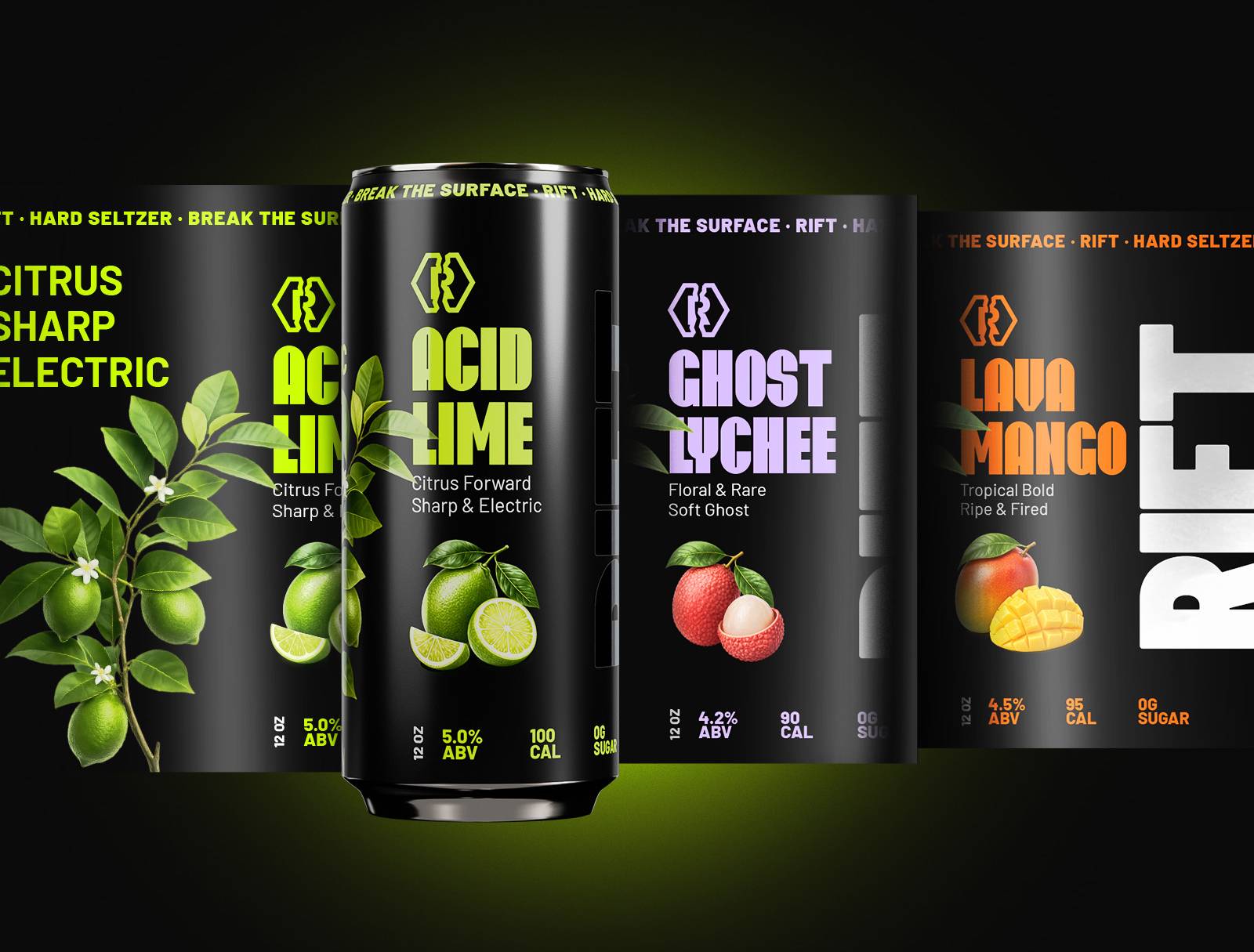
RIFT is a hard seltzer brand built for a category that is still finding its identity in most markets. The brief covered everything needed to take a new beverage brand from concept to shelf, including the brand identity, packaging, 3D product renders, and a full set of launch-ready files.
Every deliverable had to be production-ready. Nothing designed for presentation only.
Client:
Concept Brand
Services:
Brand identity,
Label design,
Product 3D Visualisation
Great products deserve iconic brands
The Challenge
Hard seltzer sits between beer and soft drinks in most retail environments. The category is crowded with brands that all borrow the same visual codes: clean, minimal, pastel, fitness-adjacent. RIFT needed to feel different without confusing the category shopper or losing shelf readability at a glance.
The additional challenge was that the brand needed to be ready to launch. Not a concept. A full set of production-ready files that could go straight to the manufacturer, printer, and marketing team simultaneously.
The approach
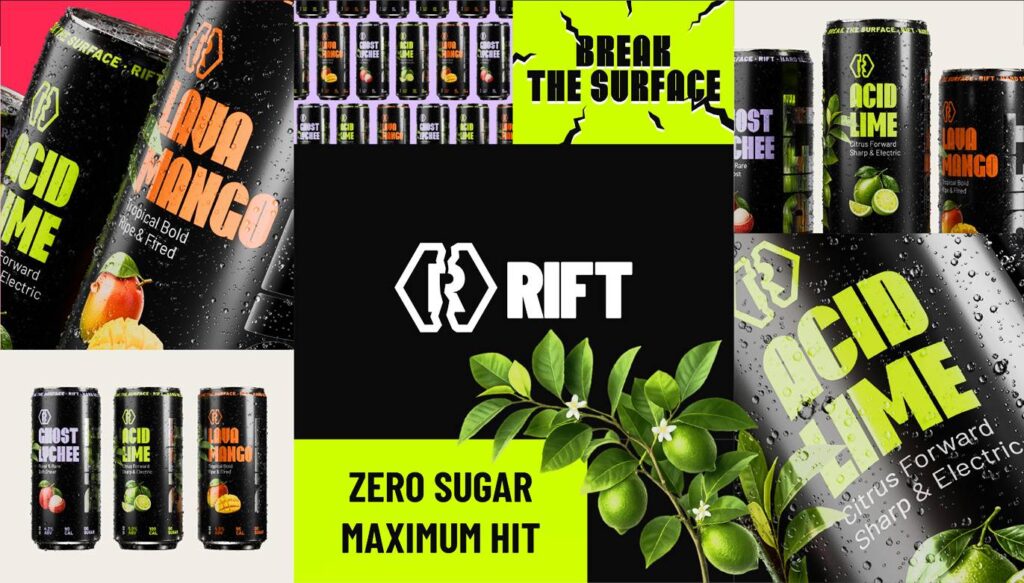
We built the identity around [describe RIFT's core visual concept here, e.g. energy, motion, a specific graphic device]. The colour system was chosen to stand out against the light, pastel-dominant category palette while remaining legible as a thumbnail on e-commerce listings.
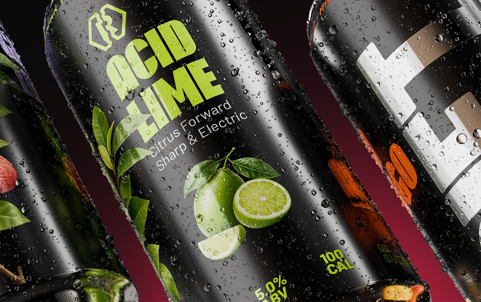
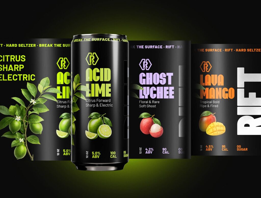
The can label was designed with the printing process in mind from the start. We specified colours within achievable print tolerances and validated the label hierarchy using 3D renders before the artwork was finalised.
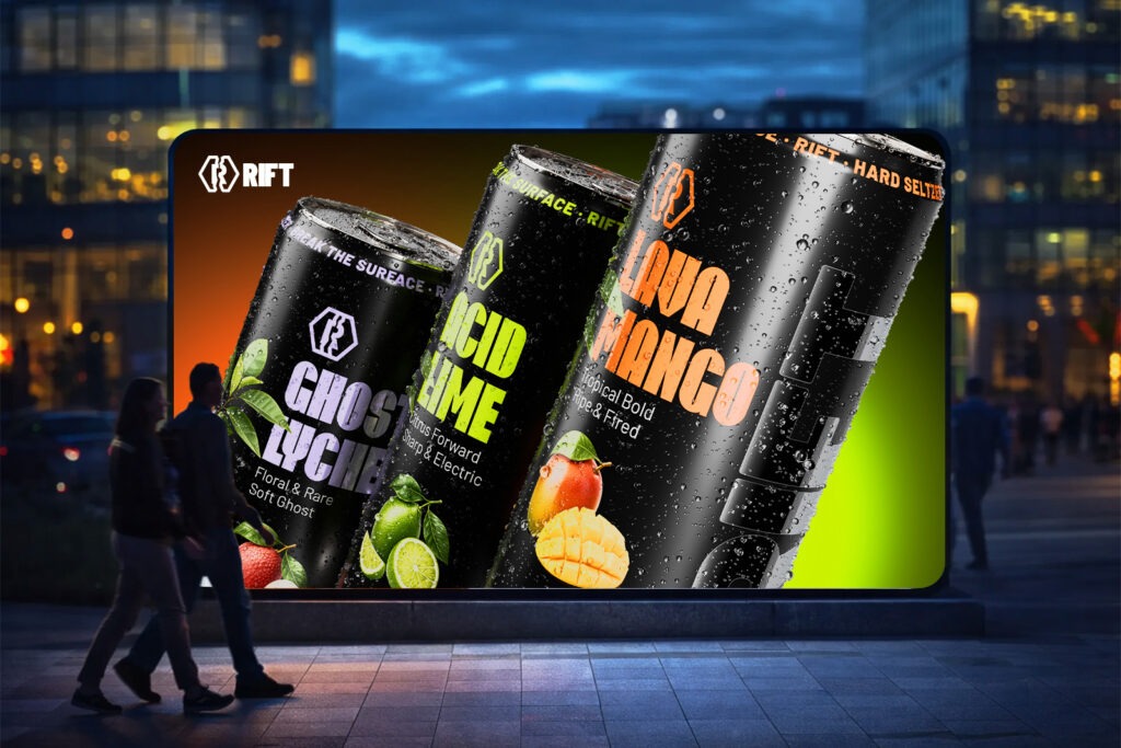
3D visualisation was used to produce the hero campaign images, in-context lifestyle renders, and the Amazon product image set, all from the same model and scene setup to keep the visual language consistent.
The goal
Take a new beverage brand from concept to a complete, production-ready launch file set. Identity, packaging, 3D renders, and campaign assets all delivered together so the manufacturer, printer, and marketing team could move at the same time.
This positioning communicates:
RIFT was built to communicate confidence in a category that defaults to safe visual choices. On shelf it reads as distinct without being difficult. For trade buyers it signals a brand that is ready to list, with no missing assets or last-minute artwork requests. For the consumer, it feels like a brand with a point of view, not one that arrived because of a deal.
