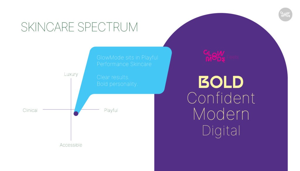
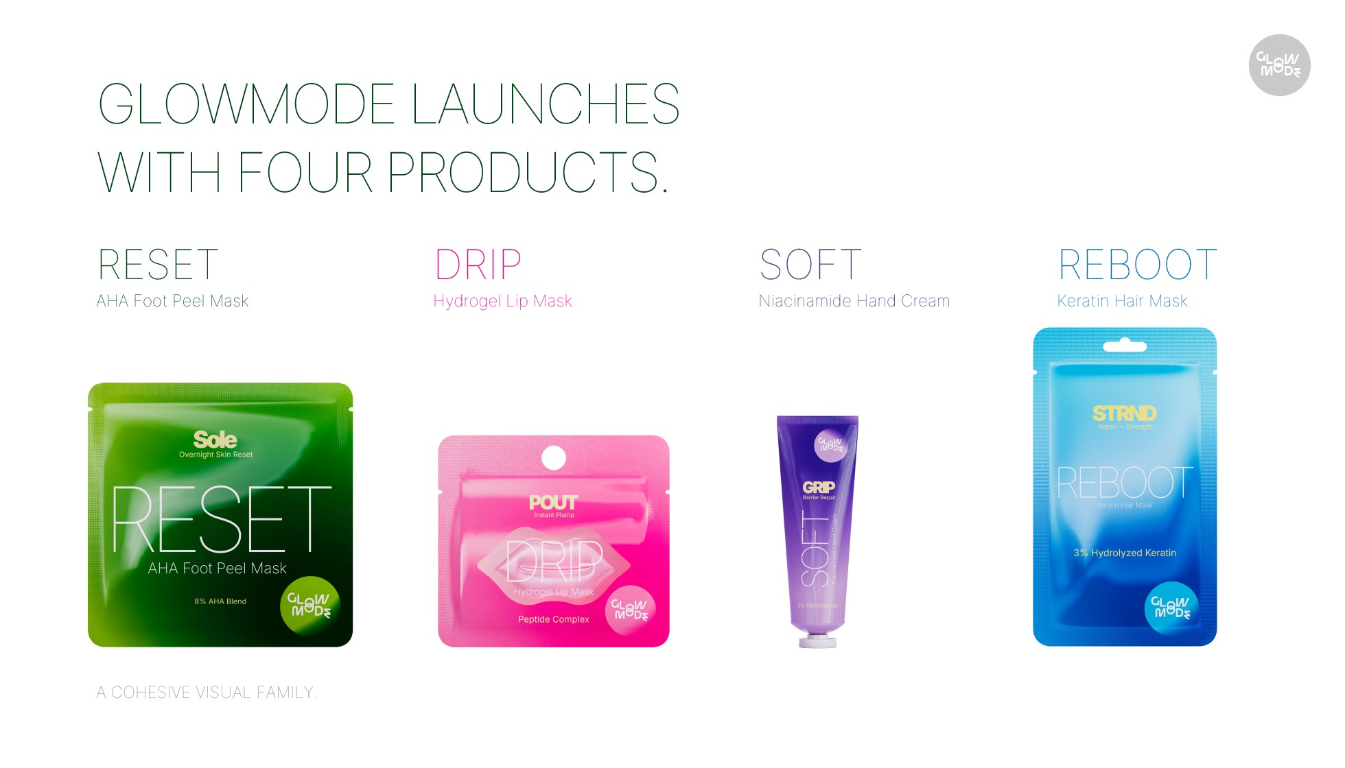
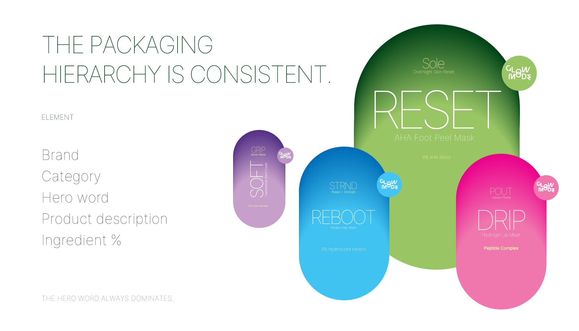
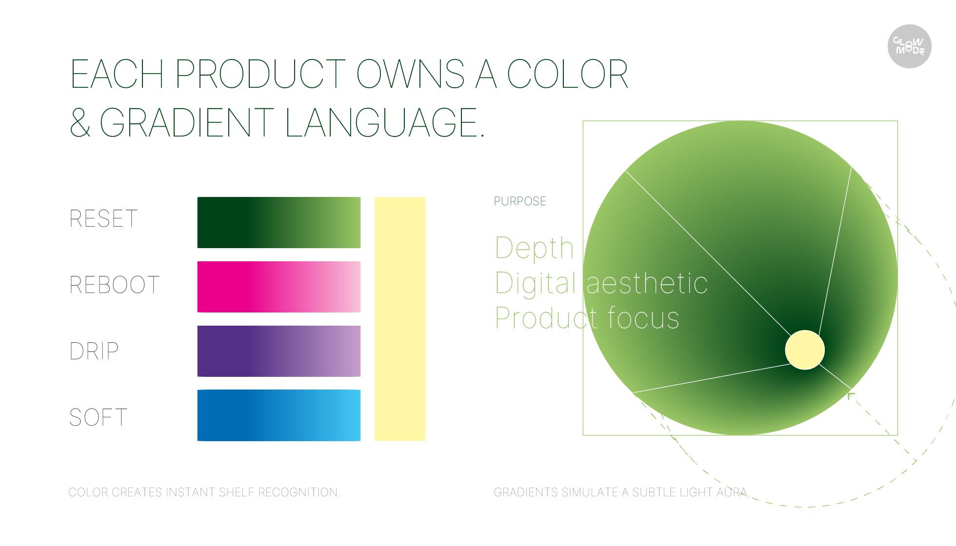
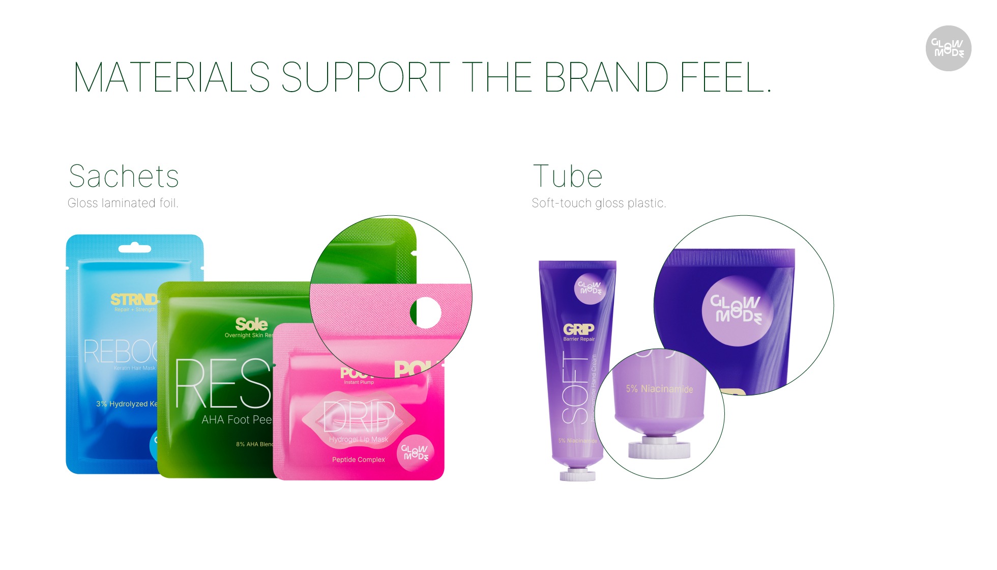
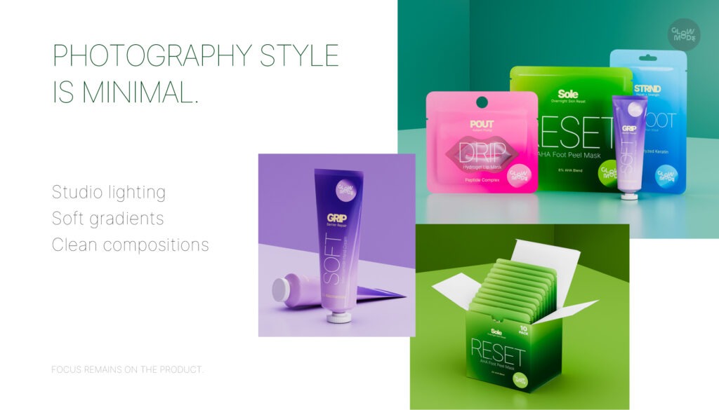
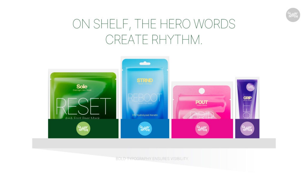
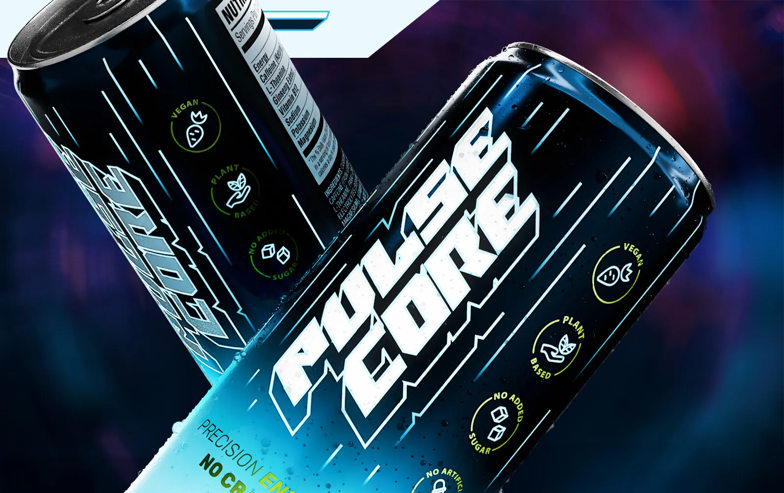
GlowMode needed a brand identity and packaging system that could work on shelf, in an e-commerce listing, and across social without needing three different sets of assets.
The brief was to build something coherent from day one. Not a logo first and packaging later. A system where every element was designed to work together across retail, DTC, and digital from the start.
Client:
Concept Brand
Services:
Brand identity,
Packaging design,
Product 3D Visualisation
Great products deserve iconic brands
The Challenge
FMCG packaging lives in two very different environments at the same time. On a physical shelf it competes with dozens of products in a three-second window of attention. On an e-commerce listing it is a thumbnail before it is a product. Most brands design for one and retrofit the other. GlowMode needed both solved in the same system.
The approach
We started with the structural packaging constraints before touching any visual design. Label size, substrate, printing method, and retail shelf depth all shaped the system before a single color was chosen.
The brand identity was built to lead with legibility at small sizes and on-shelf impact at full scale.
3D on-shelf visualization was produced at every stage of the design process, not just at the end. This let us validate how the packaging read against competing products before any print-ready files were produced.


The goal
Build a brand identity and packaging system that works on a physical shelf, in an e-commerce listing, and across social from launch day. No retrofitting. No rebuilding assets for each channel.


This positioning communicates:
GlowMode was positioned to communicate clarity and intent at every touchpoint. On shelf, the packaging earns attention without shouting. Online, the product thumbnail reads before the title does. For retailers and buyers, the system signals a brand that is built to grow, not one that will need a visual overhaul with every new SKU.
